Entirely AI generated below
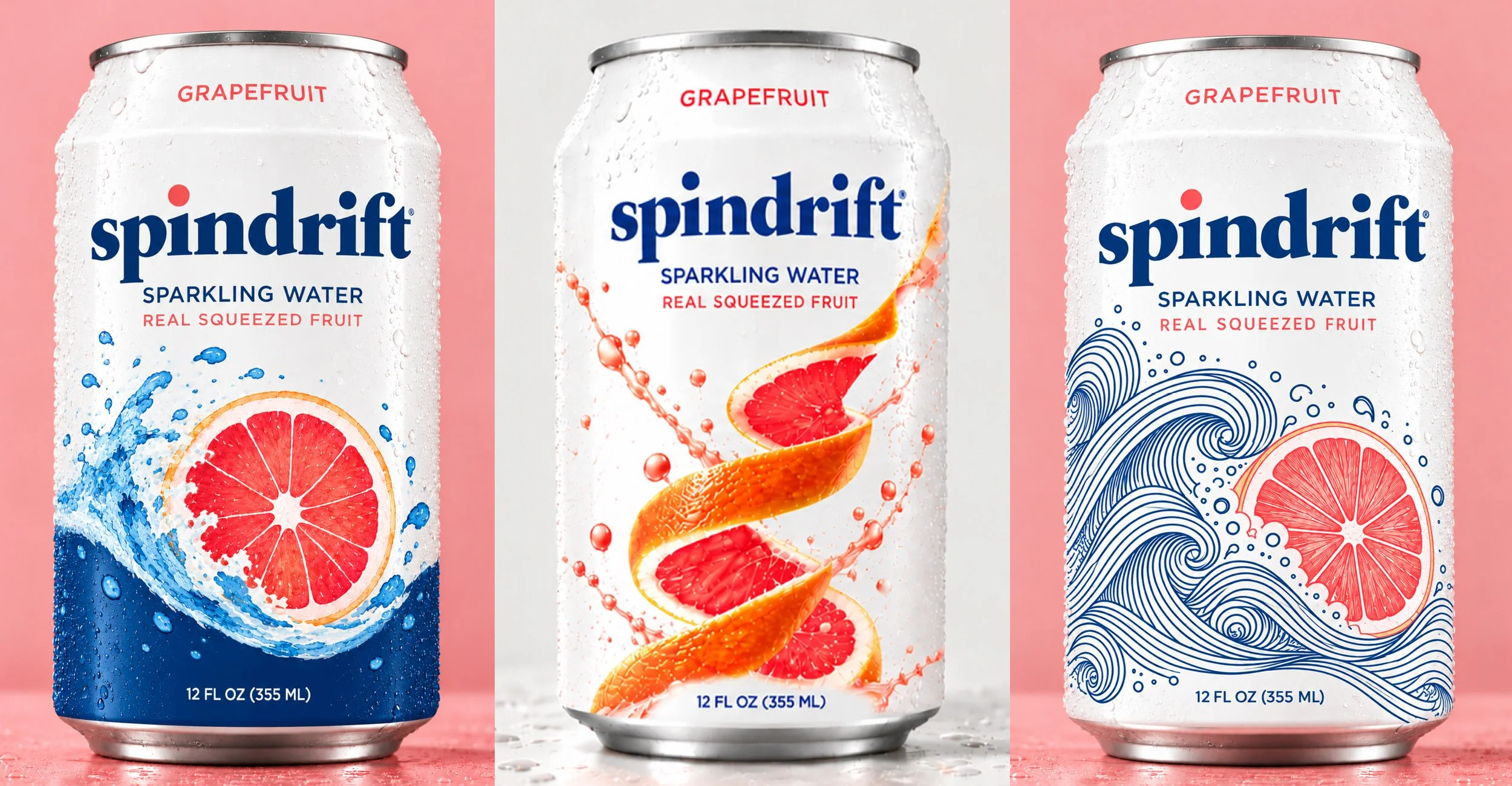
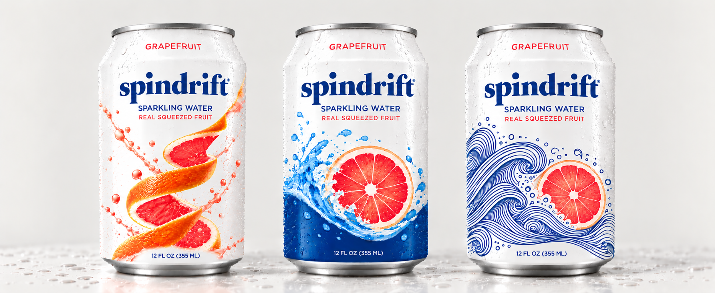
These concepts are exploratory and are not intended to be final, production-ready designs. This was a creative brainstorming exercise using ChatGPT to explore different visual directions and possibilities. Each concept would require further refinement, thoughtful design decisions, and a human touch to bring it to life.
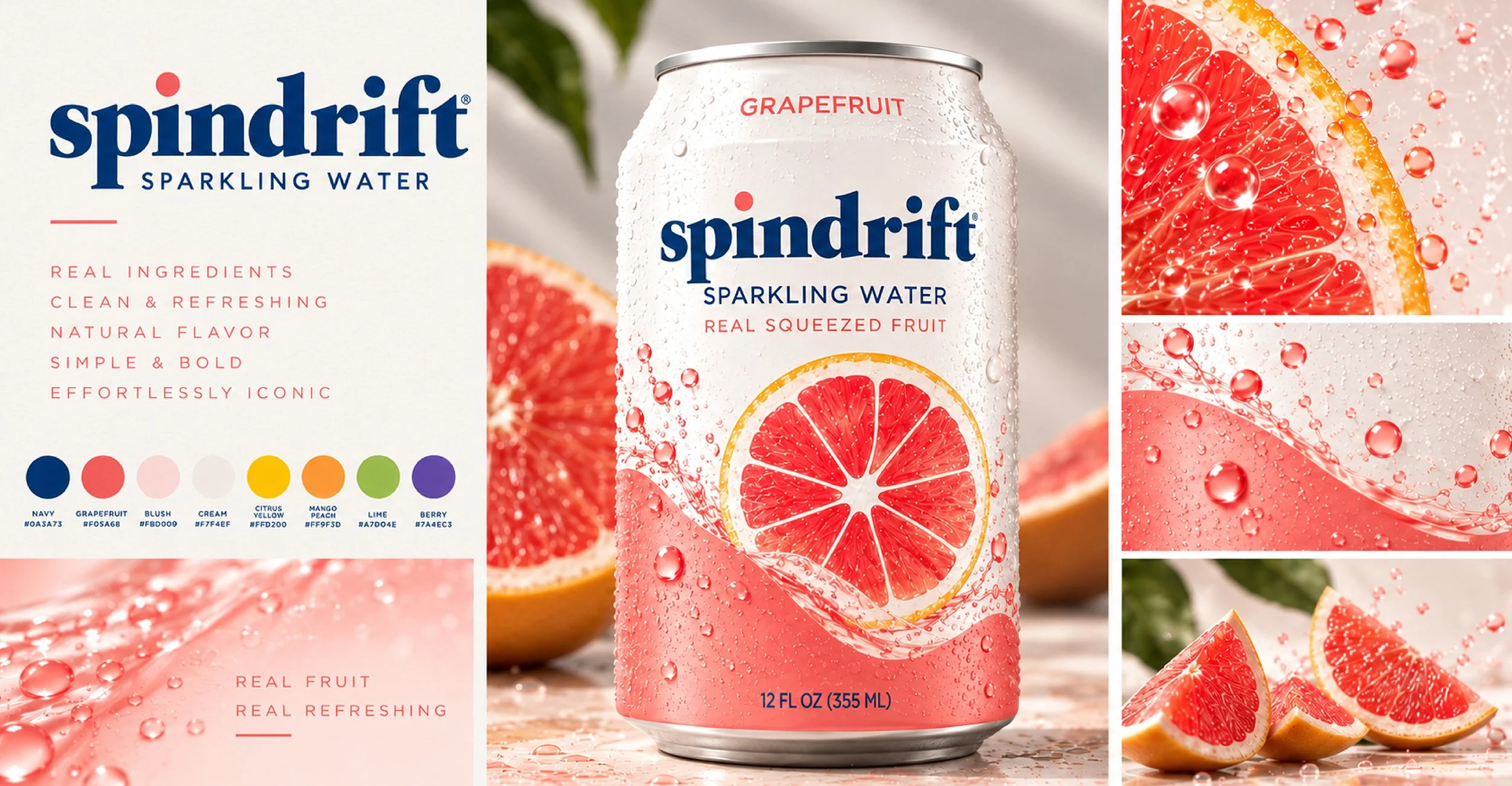
^^ Art Direction/Critique ^^ This is the closest concept to the brand keeping in mind style and placement. I would do several hand-done adjustments. the wave effect with the solid color at the bottom meeting the white is still very stiff and forced. I’d whip out a pencil and fix it so it feels more natural and organic. The drops that are in the artwork on the left don’t feel natural either. I would also keep the spindrift logo all blue.
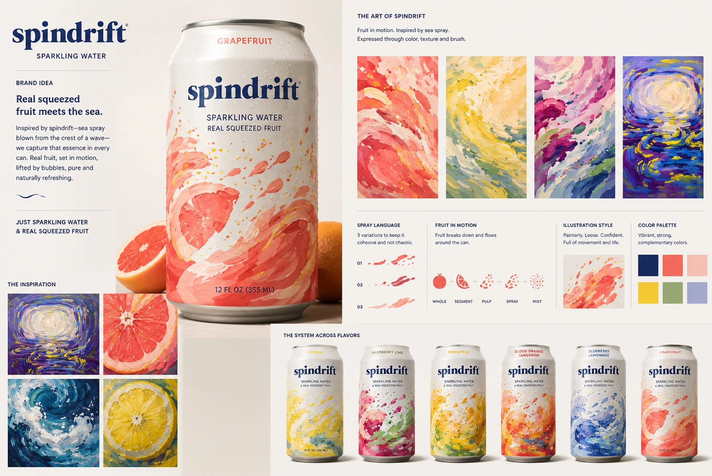
^^ Art Direction/Critique ^^ This one is actually inspired by something I did in college (directly under “THE INSPIRATION” on the left top was a painting I did. My thinking was that the abstract nature and the highlights read as water so it could be interesting. Does it feel appetizing? No. It’s a cool direction but I probably won’t pursue this one further. AI made this design a bit too chaotic for something that needs to read from far away on a shelf. It was fun to play.
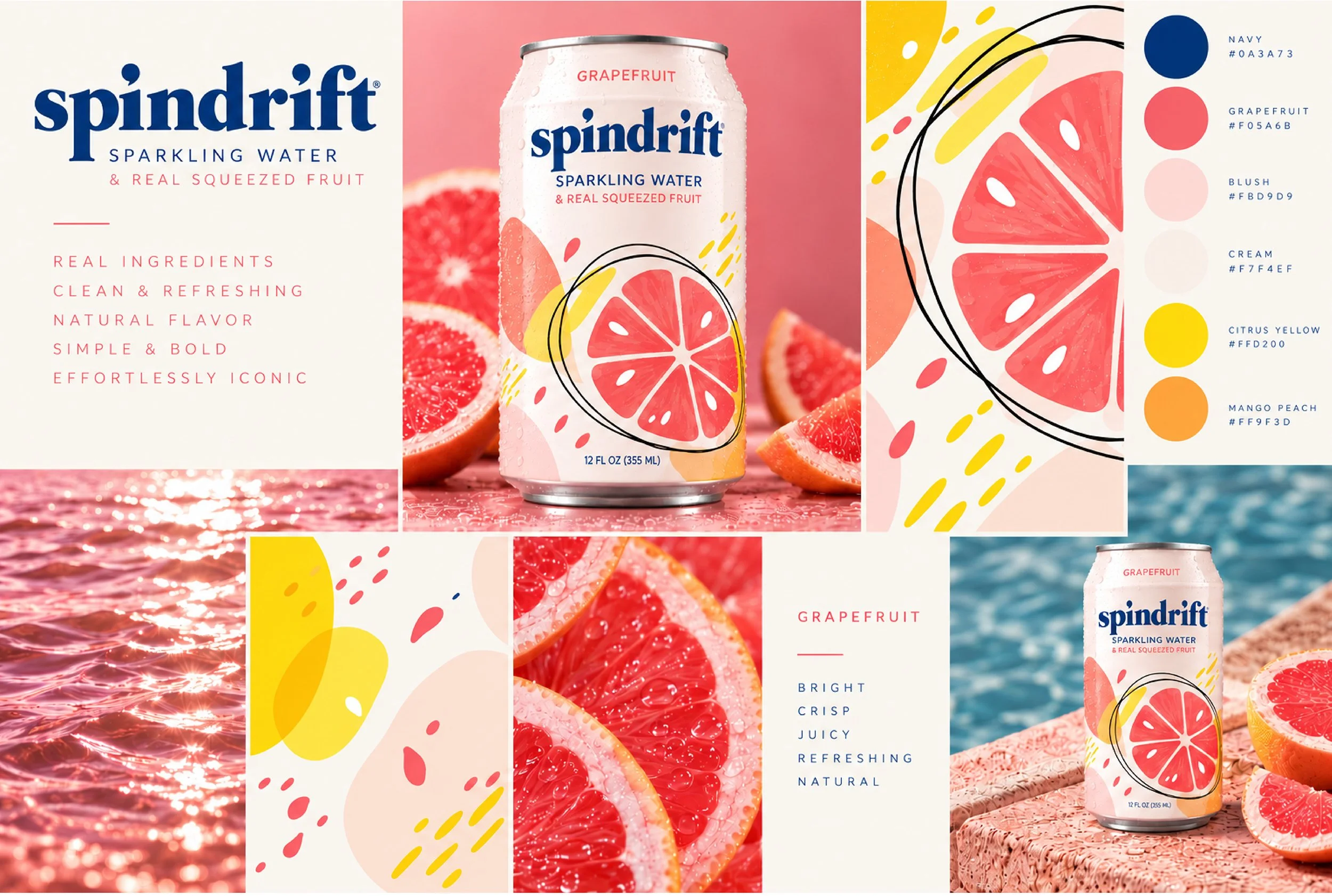
^^ Art Direction/Critique ^^ The playful nature of this design has potential, but it needs significant refinement. Incorporating the wave element would help create a stronger visual connection to the Spindrift brand, while developing a cohesive story across all flavors would make the packaging system feel more intentional.
With so much AI-generated imagery in the market, hand-drawn illustration is making a comeback. Leaning into that more organic, imperfect aesthetic could give the brand a fresh, distinctive, and relevant direction.